Zia Dashboard Insights: Make Smarter Decisions from Your Dashboard
Revenue: $2.4M ↓ 18% vs last month
It clearly shows whether performance went up or down—a drop in revenue, a spike in deals, or slower renewals. But while the data tells you what is happening, it doesn’t explain why it’s happening.
Even though these changes are easy to notice visually, understanding the reason behind them often takes extra effort. You have to open multiple reports, filter by region, segment, or product, and then manually connect the dots.
For example, a sales manager might notice that revenue dropped in March and increased in May. But to understand why, they would still need to check regional performance, product data, and customer segments separately.
Zia Dashboard Insights solves this problem
Zia Dashboard Insights bridges this gap by turning dashboard components into clear, self-explained data stories.
Instead of just showing numbers, it highlights:
Key changes
Trends and patterns
Spikes and drops
Top contributing factors
Why this matters
For a sales manager, this means:
Understanding a revenue drop in minutes instead of days
Quickly identifying whether the issue is from existing customers, a region, or a product
For sales reps:
Faster and more confident decision-making
Less time analyzing charts, more time taking action
How it works
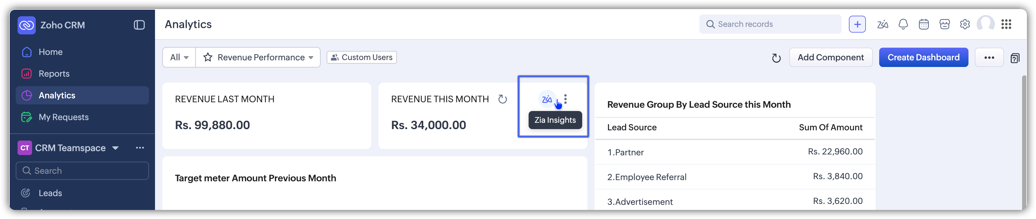
When you click the Zia icon next to a dashboard component:
Zia analyzes the data behind that component
It detects patterns like growth, decline, spikes, or dips
Example
If you’re viewing a revenue trend for the last six months, instead of just seeing ups and downs, Zia might say:
“Revenue dropped by 15% in March due to a 20% decrease in repeat purchases from existing customers.”
“Revenue increased in May, driven by a 30% rise in new enterprise customers, mainly from the North region.”
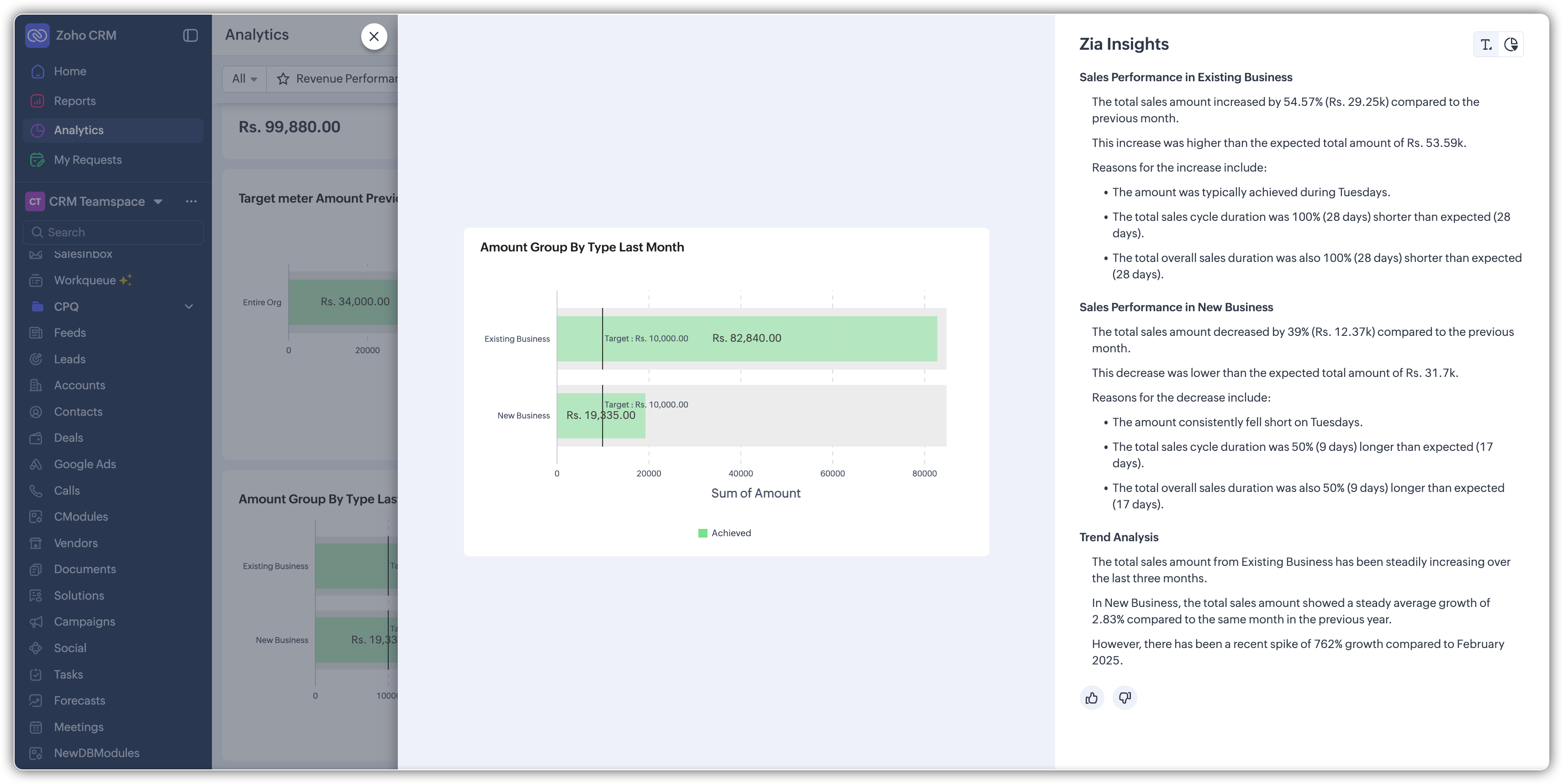
Where you see these insights
All insights are shown in a dedicated Zia Dashboard Insights panel, with two views:
Text View: Simple explanations
This view shows insights in short, easy-to-read sentences.
Each insight has a clear title
Key numbers highlight increases or decreases
You can quickly understand what changed and by how much
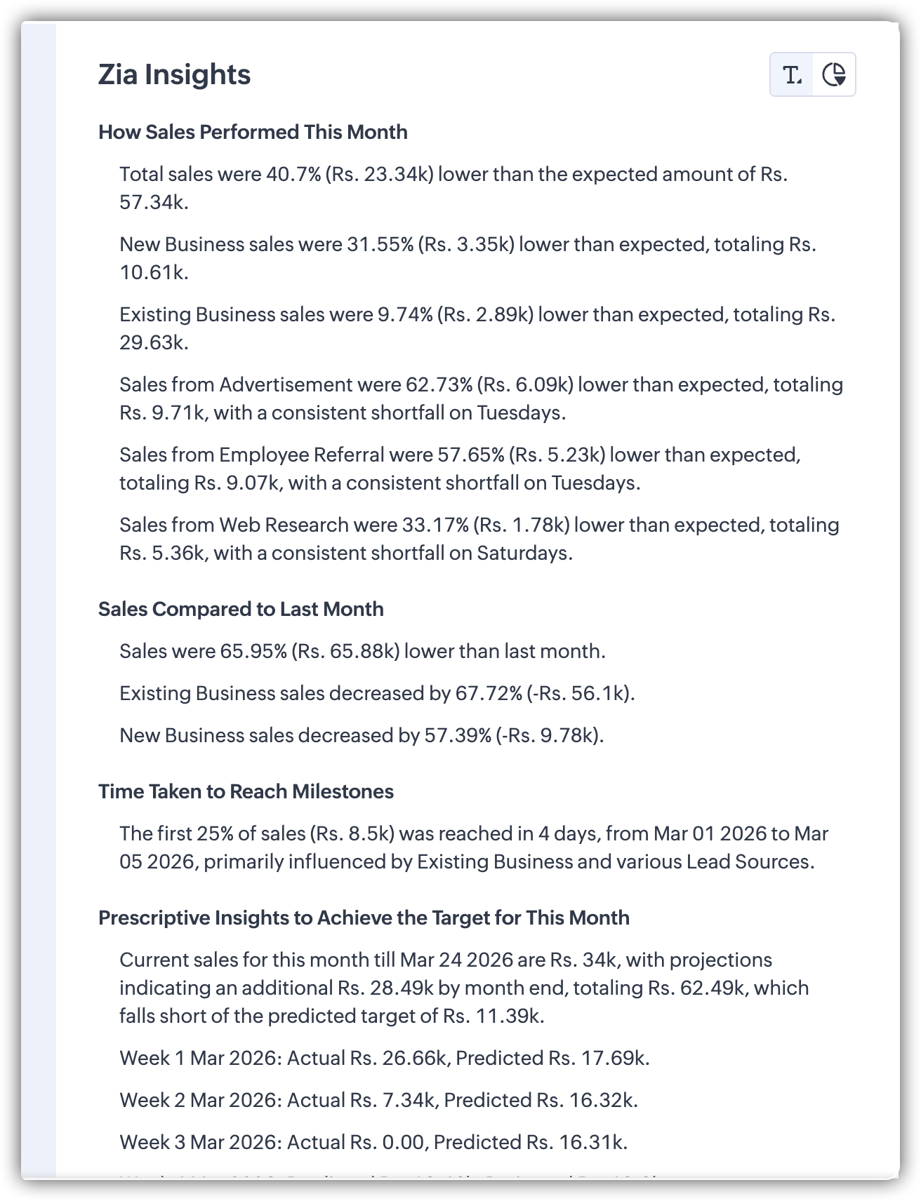
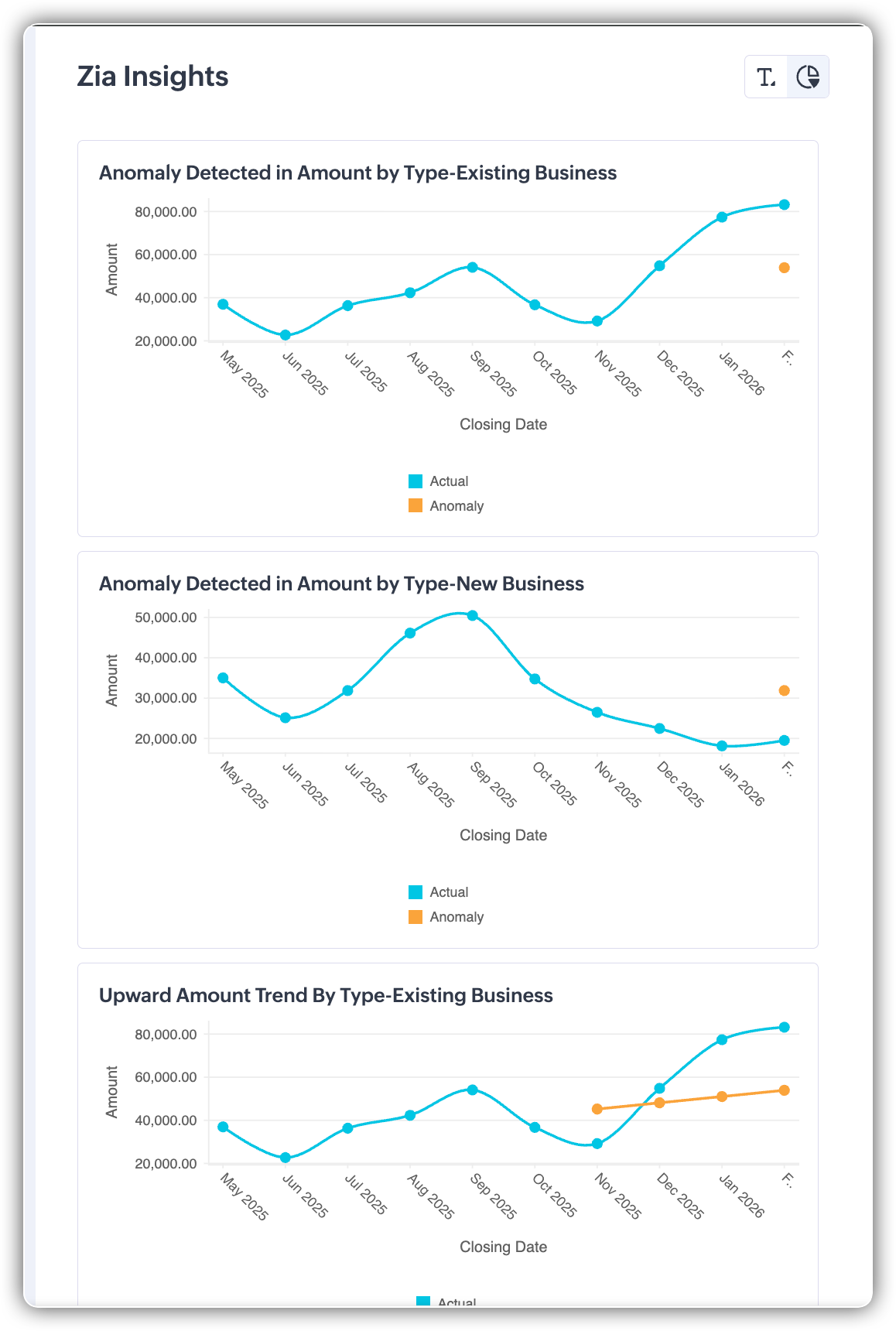
Chart View: Visual clarity
This view supports the text insights with visuals.
Highlights specific parts of the chart
Shows detailed data using tooltips
Helps you understand exactly where the change happened
Together, both views help you
Understand the insight quickly (Text View)
See the supporting data visually (Chart View)
 Points to note
 - Currently available for all KPI components and Target Meter components
- The Zia icon is your entry point; if it’s greyed out, insights aren’t available
- For current time periods (like “this month”), Zia analyzes data from the start of the period till today.
Feature availability
Available for users on the Ultimate edition of Zoho CRM
Currently released only in the US data center (DC)
Related Articles
Zoho CRM: Make Smarter Decisions with Data Enrichment
Hello everyone! The PFC group has brought a new post. Let’s explore data enrichment from a broader angle, so you can clearly understand how it works and how to use it effectively. Here’s a quick overview of what data enrichment means and how you can ...Zoho CRM Boosts Customer Insights with Zia’s Event Mapping Feature
Hello everyone, Zoho shared a powerful new feature that enhances how Zoho CRM leverages customer behavior insights. A new section titled Usage Data has been added under Zia, designed to help users import, manage, and interpret usage-related ...Zoho FSM Premium Edition Launch: Smarter Control for Growing Businesses
Hello everyone, As field service businesses scale, operations become more complex — managing distributed teams, ensuring data security, assigning the right technician, and generating timely insights. The Zoho FSM Premium Edition is built to handle ...Zoho CRM - Integration Is Key to Smarter Marketing Campaigns
Hello Marketers! Welcome back to another insightful session at Marketers' Space! Today, Zoho started an exciting series about how integrating Zoho CRM and Zoho Marketing Automation (ZMA) can revolutionize your marketing efforts. Whether you're ...Zoho CRM: Improve your A/B testing with Zia suggestions
We're thrilled to announce a suite of enhancements to our webform A/B testing feature in Zoho CRM, brought to you by Zia, designed to make your testing process more intuitive, efficient, and results-driven. The enhancements will help the users by ...